Home
/
Blog
/
Developer Insights
/
Data visualization for beginners - Part 2

Data visualization for beginners - Part 2

Author
Shubham Gupta
Calendar Icon
May 16, 2018
Timer Icon
3 min read
Share

Explore this post with:

Welcome to Part II of the series on data visualization. In the last blog post, we explored different ways to visualize continuous variables and infer information. If you haven’t visited that article, you can find it here.In this blog, we will expand our exploration to categorical variables and investigate ways in which we can visualize and gain insights from them, in isolation and in combination with variables (both categorical and continuous).

Before we dive into the different graphs and plots, let’s define a categorical variable. In statistics, a categorical variable is one which has two or more categories, but there is no intrinsic ordering to them, for example, gender, color, cities, age group, etc. If there is some kind of ordering between the categories, the variables are classified as ordinal variables, for example, if you categorize car prices by cheap, moderate and expensive. Although these are categories, there is a clear ordering between the categories.

# Importing the necessary libraries.  
import numpy as np  
import pandas as pd  
import seaborn as sns  
import matplotlib.pyplot as plt  
%matplotlib inline  

We will be using the Adult data set, which is an extraction of the 1994 census dataset. The prediction task is to determine whether a person makes more than 50K a year. Hereis the link to the dataset. In this blog, we will be using the dataset only for data analysis.

# Since the dataset doesn't contain the column header, we need to specify it manually.   
cols = ['age', 'workclass', 'fnlwgt', 'education', 'education-num', 'marital-status', 'occupation', 'relationship', 'race', 'gender', 'capital-gain', 'capital-loss', 'hours-per-week', 'native-country', 'annual-income']  

# Importing dataset   
data = pd.read_csv('adult dataset/adult.data', names=cols)  
# The first five columns of the dataset.   
data.head()  

Bar graph

A bar chart or graph is a graph with rectangular bars or bins that are used to plot categorical values. Each bar in the graph represents a categorical variable and the height of the bar is proportional to the value represented by it.

Bar graphs are used:

  • To make comparisons between variables
  • To visualize any trend in the data, i.e., they show the dependence of one variable on another
  • Estimate values of a variable
# Let's start by visualizing the distribution of gender in the dataset.  
fig, ax = plt.subplots()  
x = data.gender.unique()  
# Counting 'Males' and 'Females' in the dataset  
y = data.gender.value_counts()  
# Plotting the bar graph  
ax.bar(x, y)  
ax.set_xlabel('Gender')  
ax.set_ylabel('Count')  
plt.show()  
Bar graph, pyplot, python, data visualization,, machine learning, big data
Fig 1. Bar plot showing the distribution of gender in the dataset

From the figure, we can infer that there are more number of males than females in the dataset. Next, we will use the bar graph to visualize the distribution of annual income based on both gender and hours per week (i.e. the number of hours they work per week).

# For this plot, we will be using the seaborn library as it provides more flexibility with dataframes.   
sns.barplot(data.gender, data['hours-per-week'], hue=data['annual-income'])  
plt.show()

So from the figure above, we can infer that males and females with annual income less than 50K tend to work more per week.

Countplot

This is a seaborn-specific function which is used to plot the count or frequency distribution of each unique observation in the categorical variable. It is similar to a histogram over a categorical rather than quantitative variable.

So, let’s plot the number of males and females in the dataset using the countplot function.

# Using Countplot to count number of males and females in the dataset.  
sns.countplot(data.gender)  
plt.show()  
count plot, seabormn data visualization, python, big data, machine leanring
Fig 3. Distribution of gender using countplot.

Earlier, we plotted the same thing using a bar graph, and it required some external calculations on our part to do so. But we can do the same thing using the countplot function in just a single line of code. Next, we will see how we can use countplot for deeper insights.

# ‘hue’ is used to visualize the effect of an additional variable to the current distribution.  
sns.countplot(data.gender, hue=data['annual-income'])  
plt.show()  
countplot, using hue, data visualization using seaborn
Fig 4. Distribution of gender based on annual income using countplot.

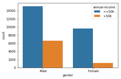
From the figure above, we can count that number of males and females whose annual income is <=50 and > 50K. We can see that the approximate number of

  • Males with annual income <=50K : 15,000
  • Males with annual income > 50K: 7000
  • Females with annual income <=50K: 9000
  • Females with annual income > 50K: 1000

So, we can infer that out of 32,500 (approx) people, only 8000 people have income greater than 50K, out of which only 1000 of them are females.
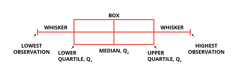
Machine learning challenge, ML challenge

Box plot

Box plots are widely used in data visualization. Box plots, also known as box and whisker plots are used to visualize variations and compare different categories in a given set of data. It doesn’t display the distribution in detail but is useful in detecting whether a distribution is skewed and detect outliers in the data. In a box and whisker plot:

  • the box spans the interquartile range
  • a vertical line inside the box represents the median
  • two lines outside the box, the whiskers, extending to the highest and the lowest observations represent the possible outliers in the data
whisker plot, box plot, seaborn, python, pyplot
Fig 5. Box and whisker plot.

Let’s use a box and whisker plot to find a correlation between ‘hours-per-week’ and ‘relationship’ based on their annual income.

# Creating a box plot  
fig, ax = plt.subplots(figsize=(15, 8))  
sns.boxplot(x='relationship', y='hours-per-week', hue='annual-income', data=data, ax=ax)  
ax.set_title('Annual Income of people based on relationship and hours-per-week')  
plt.show()  
box plot, whisker plot, visualization using box plot, box plot using seaborn, box plot in python
Fig 6. Using box plot to visualize how people in different relationships earn based on the number of hours they work per week.

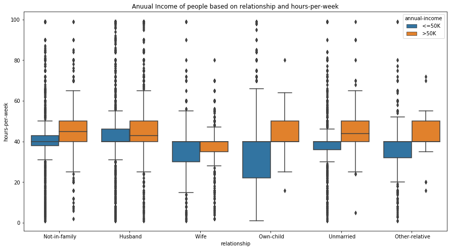
We can interpret some interesting results from the box plot. People with the same relationship status and an annual income more than 50K often work for more hours per week. Similarly, we can also infer that people who have a child and earn less than 50K tend to have more flexible working hours.
Apart from this, we can also detect outliers in the data. For example, people with relationship status ‘Not in family’ (see Fig 6.) and an income less than 50K have a large number of outliers at both the high and low ends. This also seems to be logically correct as a person who earns less than 50K annually may work more or less depending on the type of job and employment status.

Strip plot

Strip plot is a data analysis technique used to plot the sorted values of a variable along one axis. It is used to represent the distribution of a continuous variable with respect to the different levels of a categorical variable. For example, a strip plot can be used to show the distribution of the variable ‘gender’, i.e., males and females, with respect to the number of hours they work each week. A strip plot is also a good complement to a box plot or a violin plot in cases where you want to showcase all the observations along with some representation of the underlying distribution.

# Using Strip plot to visualize the data.  
fig, ax= plt.subplots(figsize=(10, 8))  
sns.stripplot(data['annual-income'], data['hours-per-week'], jitter=True, ax=ax)  
ax.set_title('Strip plot')  
plt.show()  
strip plot, strip plot using seaborn, strip plot in python, seaborn, python, machine learning, big data
Fig 7. Strip plot showing the distribution of the earnings based on the number of hours they work per week.

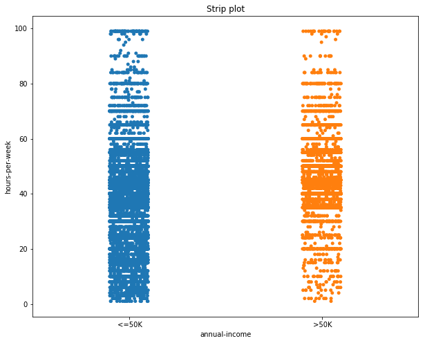
In the figure, by looking at the distribution of the data points, we can deduce that most of the people with an annual income greater than 50K work between 40 and 60 hours per week. While those with income less than 50K work can work between 0 and 60 hours per week.

Violin plot

Sometimes the mean and median may not be enough to understand the distribution of the variable in the dataset. The data may be clustered around the maximum or minimum with nothing in the middle. Box plots are a great way to summarize the statistical information related to the distribution of the data (through the interquartile range, mean, median), but they cannot be used to visualize the variations in the distributions.

A violin plot is a combination of a box plot and kernel density function (KDE, described in Part I of this blog series) which can be used to visualize the probability distribution of the data. Violin plots can be interpreted as follows:

  • The outer layer shows the probability distribution of the data points and indicates 95% confidence interval. The thicker the layer, the higher the probability of the data points, and vice-versa.
  • The second layer shows a box plot indicating the interquartile range.
  • The third layer, or the dot, indicates the median of the data.

    violin plot, interpreting a violin plot, how to read violin plot, violin plot in data visualization
    Fig 8. Representation of a violin plot.

Let’s now build a violin plot. To start with, we will analyze the distribution of annual income of the people w.r.t. the number of hours they work per week.

fig, ax = plt.subplots(figsize=(10, 8))  
sns.violinplot(x='annual-income', y='hours-per-week', data=data, ax=ax)  
ax.set_title('Violin plot')  
plt.show()  
violin plot, visualization using violin plot, violin plot using seaborn, how to plot using violin plot
Fig 9. Violin plot showing the distribution of the annual income based on the number of hours they work per week.

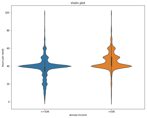
In Fig 9, the median number working hours per week is same (40 approximately) for both people earning less than 50K and greater than 50K. Although people earning less than 50K can have a varied range of the hours they spend working per week, most of the people who earn more than 50K work in the range of 40 – 80 hours per week.

Next, we can visualize the same distribution, but this grouping them according to their gender.

# Violin plot  
fig, ax = plt.subplots(figsize=(10, 8))  
sns.violinplot(x='annual-income', y='hours-per-week', hue='gender', data=data, ax=ax)  
ax.set_title('Violin plot grouped according to gender')  
plt.show()  
data visualization using violin plot, violin plot in seaborn, seaborn plots, plots in big data, plots in machine learning
Fig 10. Distribution of annual income based on the number of hours worked per week and gender.

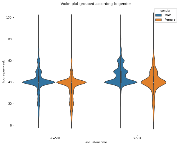
Adding the variable ‘gender’, gives us insights into how much each gender spends working per week based upon their annual income. From the figure, we can infer that males with annual income less than 50K tends to spend more hours working per week than females. But for people earning greater than 50K, both males and females spend an equal amount of hours per week working.

Violin plots, although more informative, are less frequently used in data visualization. It may be because they are hard to grasp and understand at first glance. But their ability to represent the variations in the data are making them popular among machine learning and data enthusiasts.

PairGrid

PairGrid is used to plot the pairwise relationship of all the variables in a dataset. This may seem to be similar to the pairplot we discussed in part I of this series. The difference is that instead of plotting all the plots automatically, as in the case of pairplot, Pair Grid creates a class instance, allowing us to map specific functions to the different sections of the grid.

Let’s start by defining the class.

# Creating an instance of the pair grid plot.  
g = sns.PairGrid(data=data, hue='annual-income')  

The variable ‘g’ here is a class instance. If we were to display ‘g’, then we will get a grid of empty plots. There are four grid sections to fill in a Pair Grid: upper triangle, lower triangle, the diagonal, and off-diagonal. To fill all the sections with the same plot, we can simply call ‘g.map’ with the type of plot and plot parameters.

# Creating a scatter plots for all pairs of variables.  
g = sns.PairGrid(data=data, hue='capital-gain')  
g.map(plt.scatter)  
data visualization using pair plot, visualizing multiple variabels, pair plot in seaborn, how to use pair plot
Fig 11. Scatter plot between each variable pair in the dataset.

The ‘g.map_lower’ method only fills the lower triangle of the grid while the ‘g.map_upper’ method only fills the upper triangle of the grid. Similarly, ‘g.map_diag’ and ‘g.map_offdiag’ fills the diagonal and off-diagonal of the grid, respectively.

#Here we plot scatter plot, histogram and violin plot using Pair grid.  
g = sns.PairGrid(data=data, vars = ['age', 'education-num', 'hours-per-week'])  
# with the help of the vars parameter we can select the variables between which we want the plot to be constructed.  

g.map_lower(plt.scatter, color='red')  
g.map_diag(plt.hist, bins=15)  
g.map_upper(sns.violinplot)  
data visualization using pair grid, how to use pair grid, pair grid, pair grid in seaborn, pair grid for big data
Fig 12. Pair Grid showing different plot between the different pair of variables.

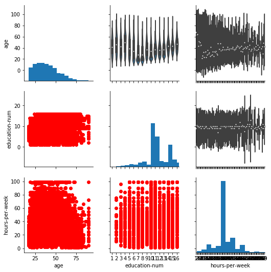
Thus with the help of Pair Grid, we can visualize the relationship between the three variables (‘hours-per-week’, ‘education-num’ and ‘age’) using three different plots all in the same figure. Pair grid comes in handy when visualizing multiple plots in the same figure.

Conclusion

Let’s summarize what we learned. So, we started with visualizing the distribution of categorical variables in isolation. Then, we moved on to visualize the relationship between a categorical and a continuous variable. Finally, we explored visualizing relationships when more than two variables are involved. Next week, we will explore how we can visualize unstructured data. Finally, I encourage you to download the given census data (used in this blog) or any other dataset of your choice and play with all the variations of the plots learned in this blog. Till then, Adiós!

Subscribe to The HackerEarth Blog

Get expert tips, hacks, and how-tos from the world of tech recruiting to stay on top of your hiring!

Author
Shubham Gupta
Calendar Icon
May 16, 2018
Timer Icon
3 min read
Share

Hire top tech talent with our recruitment platform

Access Free Demo
Related reads

Discover more articles

Gain insights to optimize your developer recruitment process.

How I used VibeCode Arena platform to build code using AI and leant how to improve it

I Used AI to Build a "Simple Image Carousel" at VibeCodeArena. It Found 15+ Issues and Taught Me How to Fix Them.

My Learning Journey

I wanted to understand what separates working code from good code. So I used VibeCodeArena.ai to pick a problem statement where different LLMs produce code for the same prompt. Upon landing on the main page of VibeCodeArena, I could see different challenges. Since I was interested in an Image carousal application, I picked the challenge with the prompt "Make a simple image carousel that lets users click 'next' and 'previous' buttons to cycle through images."

Within seconds, I had code from multiple LLMs, including DeepSeek, Mistral, GPT, and Llama. Each code sample also had an objective evaluation score. I was pleasantly surprised to see so many solutions for the same problem. I picked gpt-oss-20b model from OpenAI. For this experiment, I wanted to focus on learning how to code better so either one of the LLMs could have worked. But VibeCodeArena can also be used to evaluate different LLMs to help make a decision about which model to use for what problem statement.

The model had produced a clean HTML, CSS, and JavaScript. The code looked professional. I could see the preview of the code by clicking on the render icon. It worked perfectly in my browser. The carousel was smooth, and the images loaded beautifully.

But was it actually good code?

I had no idea. That's when I decided to look at the evaluation metrics

What I Thought Was "Good Code"

A working image carousel with:

  • Clean, semantic HTML
  • Smooth CSS transitions
  • Keyboard navigation support
  • ARIA labels for accessibility
  • Error handling for failed images

It looked like something a senior developer would write. But I had questions:

Was it secure? Was it optimized? Would it scale? Were there better ways to structure it?

Without objective evaluation, I had no answers. So, I proceeded to look at the detailed evaluation metrics for this code

What VibeCodeArena's Evaluation Showed

The platform's objective evaluation revealed issues I never would have spotted:

Security Vulnerabilities (The Scary Ones)

No Content Security Policy (CSP): My carousel was wide open to XSS attacks. Anyone could inject malicious scripts through the image URLs or manipulate the DOM. VibeCodeArena flagged this immediately and recommended implementing CSP headers.

Missing Input Validation: The platform pointed out that while the code handles image errors, it doesn't validate or sanitize the image sources. A malicious actor could potentially exploit this.

Hardcoded Configuration: Image URLs and settings were hardcoded directly in the code. The platform recommended using environment variables instead - a best practice I completely overlooked.

SQL Injection Vulnerability Patterns: Even though this carousel doesn't use a database, the platform flagged coding patterns that could lead to SQL injection in similar contexts. This kind of forward-thinking analysis helps prevent copy-paste security disasters.

Performance Problems (The Silent Killers)

DOM Structure Depth (15 levels): VibeCodeArena measured my DOM at 15 levels deep. I had no idea. This creates unnecessary rendering overhead that would get worse as the carousel scales.

Expensive DOM Queries: The JavaScript was repeatedly querying the DOM without caching results. Under load, this would create performance bottlenecks I'd never notice in local testing.

Missing Performance Optimizations: The platform provided a checklist of optimizations I didn't even know existed:

  • No DNS-prefetch hints for external image domains
  • Missing width/height attributes causing layout shift
  • No preload directives for critical resources
  • Missing CSS containment properties
  • No will-change property for animated elements

Each of these seems minor, but together they compound into a poor user experience.

Code Quality Issues (The Technical Debt)

High Nesting Depth (4 levels): My JavaScript had logic nested 4 levels deep. VibeCodeArena flagged this as a maintainability concern and suggested flattening the logic.

Overly Specific CSS Selectors (depth: 9): My CSS had selectors 9 levels deep, making it brittle and hard to refactor. I thought I was being thorough; I was actually creating maintenance nightmares.

Code Duplication (7.9%): The platform detected nearly 8% code duplication across files. That's technical debt accumulating from day one.

Moderate Maintainability Index (67.5): While not terrible, the platform showed there's significant room for improvement in code maintainability.

Missing Best Practices (The Professional Touches)

The platform also flagged missing elements that separate hobby projects from professional code:

  • No 'use strict' directive in JavaScript
  • Missing package.json for dependency management
  • No test files
  • Missing README documentation
  • No .gitignore or version control setup
  • Could use functional array methods for cleaner code
  • Missing CSS animations for enhanced UX

The "Aha" Moment

Here's what hit me: I had no framework for evaluating code quality beyond "does it work?"

The carousel functioned. It was accessible. It had error handling. But I couldn't tell you if it was secure, optimized, or maintainable.

VibeCodeArena gave me that framework. It didn't just point out problems, it taught me what production-ready code looks like.

My New Workflow: The Learning Loop

This is when I discovered the real power of the platform. Here's my process now:

Step 1: Generate Code Using VibeCodeArena

I start with a prompt and let the AI generate the initial solution. This gives me a working baseline.

Step 2: Analyze Across Several Metrics

I can get comprehensive analysis across:

  • Security vulnerabilities
  • Performance/Efficiency issues
  • Performance optimization opportunities
  • Code Quality improvements

This is where I learn. Each issue includes explanation of why it matters and how to fix it.

Step 3: Click "Challenge" and Improve

Here's the game-changer: I click the "Challenge" button and start fixing the issues based on the suggestions. This turns passive reading into active learning.

Do I implement CSP headers correctly? Does flattening the nested logic actually improve readability? What happens when I add dns-prefetch hints?

I can even use AI to help improve my code. For this action, I can use from a list of several available models that don't need to be the same one that generated the code. This helps me to explore which models are good at what kind of tasks.

For my experiment, I decided to work on two suggestions provided by VibeCodeArena by preloading critical CSS/JS resources with <link rel="preload"> for faster rendering in index.html and by adding explicit width and height attributes to images to prevent layout shift in index.html. The code editor gave me change summary before I submitted by code for evaluation.

Step 4: Submit for Evaluation

After making improvements, I submit my code for evaluation. Now I see:

  • What actually improved (and by how much)
  • What new issues I might have introduced
  • Where I still have room to grow

Step 5: Hey, I Can Beat AI

My changes helped improve the performance metric of this simple code from 82% to 83% - Yay! But this was just one small change. I now believe that by acting upon multiple suggestions, I can easily improve the quality of the code that I write versus just relying on prompts.

Each improvement can move me up the leaderboard. I'm not just learning in isolation—I'm seeing how my solutions compare to other developers and AI models.

So, this is the loop: Generate → Analyze → Challenge → Improve → Measure → Repeat.

Every iteration makes me better at both evaluating AI code and writing better prompts.

What This Means for Learning to Code with AI

This experience taught me three critical lessons:

1. Working ≠ Good Code

AI models are incredible at generating code that functions. But "it works" tells you nothing about security, performance, or maintainability.

The gap between "functional" and "production-ready" is where real learning happens. VibeCodeArena makes that gap visible and teachable.

2. Improvement Requires Measurement

I used to iterate on code blindly: "This seems better... I think?"

Now I know exactly what improved. When I flatten nested logic, I see the maintainability index go up. When I add CSP headers, I see security scores improve. When I optimize selectors, I see performance gains.

Measurement transforms vague improvement into concrete progress.

3. Competition Accelerates Learning

The leaderboard changed everything for me. I'm not just trying to write "good enough" code—I'm trying to climb past other developers and even beat the AI models.

This competitive element keeps me pushing to learn one more optimization, fix one more issue, implement one more best practice.

How the Platform Helps Me Become A Better Programmer

VibeCodeArena isn't just an evaluation tool—it's a structured learning environment. Here's what makes it effective:

Immediate Feedback: I see issues the moment I submit code, not weeks later in code review.

Contextual Education: Each issue comes with explanation and guidance. I learn why something matters, not just that it's wrong.

Iterative Improvement: The "Challenge" button transforms evaluation into action. I learn by doing, not just reading.

Measurable Progress: I can track my improvement over time—both in code quality scores and leaderboard position.

Comparative Learning: Seeing how my solutions stack up against others shows me what's possible and motivates me to reach higher.

What I've Learned So Far

Through this iterative process, I've gained practical knowledge I never would have developed just reading documentation:

  • How to implement Content Security Policy correctly
  • Why DOM depth matters for rendering performance
  • What CSS containment does and when to use it
  • How to structure code for better maintainability
  • Which performance optimizations actually make a difference

Each "Challenge" cycle teaches me something new. And because I'm measuring the impact, I know what actually works.

The Bottom Line

AI coding tools are incredible for generating starting points. But they don't produce high quality code and can't teach you what good code looks like or how to improve it.

VibeCodeArena bridges that gap by providing:

✓ Objective analysis that shows you what's actually wrong
✓ Educational feedback that explains why it matters
✓ A "Challenge" system that turns learning into action
✓ Measurable improvement tracking so you know what works
✓ Competitive motivation through leaderboards

My "simple image carousel" taught me an important lesson: The real skill isn't generating code with AI. It's knowing how to evaluate it, improve it, and learn from the process.

The future of AI-assisted development isn't just about prompting better. It's about developing the judgment to make AI-generated code production-ready. That requires structured learning, objective feedback, and iterative improvement. And that's exactly what VibeCodeArena delivers.

Here is a link to the code for the image carousal I used for my learning journey

#AIcoding #WebDevelopment #CodeQuality #VibeCoding #SoftwareEngineering #LearningToCode

The Mobile Dev Hiring Landscape Just Changed

Revolutionizing Mobile Talent Hiring: The HackerEarth Advantage

The demand for mobile applications is exploding, but finding and verifying developers with proven, real-world skills is more difficult than ever. Traditional assessment methods often fall short, failing to replicate the complexities of modern mobile development.

Introducing a New Era in Mobile Assessment

At HackerEarth, we're closing this critical gap with two groundbreaking features, seamlessly integrated into our Full Stack IDE:

Article content

Now, assess mobile developers in their true native environment. Our enhanced Full Stack questions now offer full support for both Java and Kotlin, the core languages powering the Android ecosystem. This allows you to evaluate candidates on authentic, real-world app development skills, moving beyond theoretical knowledge to practical application.

Article content

Say goodbye to setup drama and tool-switching. Candidates can now build, test, and debug Android and React Native applications directly within the browser-based IDE. This seamless, in-browser experience provides a true-to-life evaluation, saving valuable time for both candidates and your hiring team.

Assess the Skills That Truly Matter

With native Android support, your assessments can now delve into a candidate's ability to write clean, efficient, and functional code in the languages professional developers use daily. Kotlin's rapid adoption makes proficiency in it a key indicator of a forward-thinking candidate ready for modern mobile development.

Breakup of Mobile development skills ~95% of mobile app dev happens through Java and Kotlin
This chart illustrates the importance of assessing proficiency in both modern (Kotlin) and established (Java) codebases.

Streamlining Your Assessment Workflow

The integrated mobile emulator fundamentally transforms the assessment process. By eliminating the friction of fragmented toolchains and complex local setups, we enable a faster, more effective evaluation and a superior candidate experience.

Old Fragmented Way vs. The New, Integrated Way
Visualize the stark difference: Our streamlined workflow removes technical hurdles, allowing candidates to focus purely on demonstrating their coding and problem-solving abilities.

Quantifiable Impact on Hiring Success

A seamless and authentic assessment environment isn't just a convenience, it's a powerful catalyst for efficiency and better hiring outcomes. By removing technical barriers, candidates can focus entirely on demonstrating their skills, leading to faster submissions and higher-quality signals for your recruiters and hiring managers.

A Better Experience for Everyone

Our new features are meticulously designed to benefit the entire hiring ecosystem:

For Recruiters & Hiring Managers:

  • Accurately assess real-world development skills.
  • Gain deeper insights into candidate proficiency.
  • Hire with greater confidence and speed.
  • Reduce candidate drop-off from technical friction.

For Candidates:

  • Enjoy a seamless, efficient assessment experience.
  • No need to switch between different tools or manage complex setups.
  • Focus purely on showcasing skills, not environment configurations.
  • Work in a powerful, professional-grade IDE.

Unlock a New Era of Mobile Talent Assessment

Stop guessing and start hiring the best mobile developers with confidence. Explore how HackerEarth can transform your tech recruiting.

Vibe Coding: Shaping the Future of Software

A New Era of Code

Vibe coding is a new method of using natural language prompts and AI tools to generate code. I have seen firsthand that this change makes software more accessible to everyone. In the past, being able to produce functional code was a strong advantage for developers. Today, when code is produced quickly through AI, the true value lies in designing, refining, and optimizing systems. Our role now goes beyond writing code; we must also ensure that our systems remain efficient and reliable.

From Machine Language to Natural Language

I recall the early days when every line of code was written manually. We progressed from machine language to high-level programming, and now we are beginning to interact with our tools using natural language. This development does not only increase speed but also changes how we approach problem solving. Product managers can now create working demos in hours instead of weeks, and founders have a clearer way of pitching their ideas with functional prototypes. It is important for us to rethink our role as developers and focus on architecture and system design rather than simply on typing c

Vibe Coding Difference

The Promise and the Pitfalls

I have experienced both sides of vibe coding. In cases where the goal was to build a quick prototype or a simple internal tool, AI-generated code provided impressive results. Teams have been able to test new ideas and validate concepts much faster. However, when it comes to more complex systems that require careful planning and attention to detail, the output from AI can be problematic. I have seen situations where AI produces large volumes of code that become difficult to manage without significant human intervention.

AI-powered coding tools like GitHub Copilot and AWS’s Q Developer have demonstrated significant productivity gains. For instance, at the National Australia Bank, it’s reported that half of the production code is generated by Q Developer, allowing developers to focus on higher-level problem-solving . Similarly, platforms like Lovable or Hostinger Horizons enable non-coders to build viable tech businesses using natural language prompts, contributing to a shift where AI-generated code reduces the need for large engineering teams. However, there are challenges. AI-generated code can sometimes be verbose or lack the architectural discipline required for complex systems. While AI can rapidly produce prototypes or simple utilities, building large-scale systems still necessitates experienced engineers to refine and optimize the code.​

The Economic Impact

The democratization of code generation is altering the economic landscape of software development. As AI tools become more prevalent, the value of average coding skills may diminish, potentially affecting salaries for entry-level positions. Conversely, developers who excel in system design, architecture, and optimization are likely to see increased demand and compensation.​
Seizing the Opportunity

Vibe coding is most beneficial in areas such as rapid prototyping and building simple applications or internal tools. It frees up valuable time that we can then invest in higher-level tasks such as system architecture, security, and user experience. When used in the right context, AI becomes a helpful partner that accelerates the development process without replacing the need for skilled engineers.

This is revolutionizing our craft, much like the shift from machine language to assembly to high-level languages did in the past. AI can churn out code at lightning speed, but remember, “Any fool can write code that a computer can understand. Good programmers write code that humans can understand.” Use AI for rapid prototyping, but it’s your expertise that transforms raw output into robust, scalable software. By honing our skills in design and architecture, we ensure our work remains impactful and enduring. Let’s continue to learn, adapt, and build software that stands the test of time.​

Ready to streamline your recruitment process? Get a free demo to explore cutting-edge solutions and resources for your hiring needs.

Top Products

Explore HackerEarth’s top products for Hiring & Innovation

Discover powerful tools designed to streamline hiring, assess talent efficiently, and run seamless hackathons. Explore HackerEarth’s top products that help businesses innovate and grow.
Frame
Hackathons
Engage global developers through innovation
Arrow
Frame 2
Assessments
AI-driven advanced coding assessments
Arrow
Frame 3
FaceCode
Real-time code editor for effective coding interviews
Arrow
Frame 4
L & D
Tailored learning paths for continuous assessments
Arrow
Get A Free Demo